
This was the book I started with, I liked it because it was like a children's journal with a spot for writing and a spot for pictures. Only instead I modified it just a little. It is the only one I could find like this so if anyone knows where I can find another please let me know.

I picked out all the papers and embellishments that I wanted to use and laid them all out nice and neatly on my table. What a joke! I think it only stayed like this long enough for me to take this picture. As soon as I started working on it, the whole table and room was a state. You can ask my mother-in-law she saw the "in progress" state. :o)

It was well worth the mess though because I am just thrilled with how it came out. This is the cover. I used the white knob from the Tim Holtz Curio Knobs , which I simply love! I also used the Color Me Crazy white paper flowers which I inked with pink ink washed off inked again and washed off again just to get the perfect off white/ pinky colour I was looking for. These flowers are great for scrapbooking and cardmaking because you can ink, paint, or color them anyway you want and in any colour you want to match your project. And seeing as there is so few scrapbooking stores in this area, these flowers are a great investment. The package I have also have sparkly white flowers which add a very nice touch to you work. So the one I inked pinked is on bottom and the sparkley one is one top. I fastened the flowers together with a Lush pink brad, these brads just scream "girlie" to me and yet I think they are incredibly elegant. Most of these products were new to me and I have to say I am very pleased with how easy they were to work with and how great they were for the cover of this book.
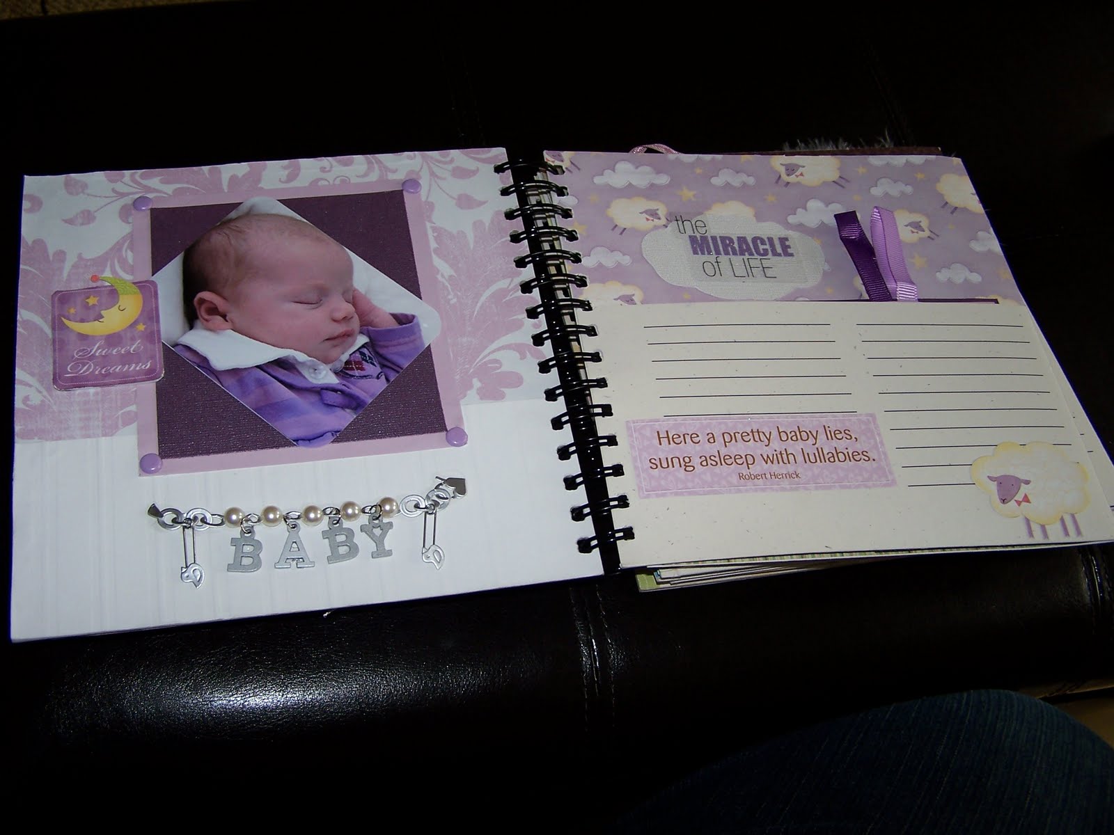 |
| These are the 2-3 pages of the book. Isn't she just adorable? |

Page 2: For the background I used a embossed white sheet that was done in stripes. It kind-of looked like wallpaper to me and so it was the perfect choice for the sleeping page. The "sweet dreams" and pinkish/ purplish papers where from a kit. Sorry but I don't remember the name. The brads are from a large pastel brad set that I bought. I think they complement the 3d "Baby" sticker (Walmart) nicely adding the wonderful 3d dimensions to the page that I love. I cut the corners on the photo attempting to soften it even more. I think I succeeded.


Page 3: This is the 1st page that the guests will be able to write on. I stayed with the same theme of her sleeping and the soft color purple. Again the paper was from a kit (a different one) but I don't know the name, I am sorry. The cloud was cut from a pearl like metallic paper to match the clouds on the background paper. I started using a fiiskars template but found it a little to large so I modified it just a little to get the size I needed. I made a tag that matched the theme and showed how adorable she was while sleeping. The tag is double sided and able to be pulled out by two small ribbons glued under the photos on either side, so that people can write on a flat surface.

 |
| The tag for page 7. Page 4 and 7 (Yes, I know how to count but read on to see the explanation.) Both of these pages are done very simply to optimize the space for guest to write on. Page 4 has just one photo matted with two 3d stickers. What can I say I love working with 3d. Page 7 has just one sticker "Thank heavens for little girls" and a tag that you pull up to see two more beautiful photos of the little girl. I love that when the tag sits in the pocket you just see a little bear sticking out and when you pull the tag you see her shocked face in the bottom photo, it is simply priceless. On the side of each page you will notice another Lush brad one from each of the pink and brown collections. Under each brad is a small piece of ribbon, I believe these two strips are from an older collection from American Crafts (The link is for their newer products) I really enjoy working with these ribbons as they are very sturdy. I poked holes into them and they didn't unravel like many of the ribbons out there on the market. They are double sided and come in many different coordinating colors, which make them very user friendly. Anyway... when you pull these two ribbons you will discovery 4 more pages two on either side. |
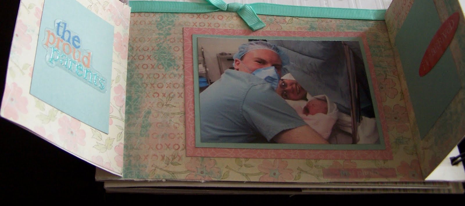
 One side for Dad and one side for Mom.

I did the same layout on both sides only I used a slightly different color paper for the background on each one. "Daddy's Baby Girl" and "Mommy's Little Princess." A very simple layout. Photos matted on light paper and a few stickers to keep the focus on the photos and hopefully indicating their importance.

To keep the identity of the child in this book non public I have edit out parts of pages 8 and 9. Page 8 was done with the same embossed paper as page 2 with ribbon going across the page and using the flat ribbon technique taught to me by a awesome co -worker. (Thanks Megan) The brads used are from Making Memories and I just had to use them when I saw them "Making Memories Boho Chic Brad Accents - Lauren" cute huh? When you use the ribbon tabs to open the page you have a gate fold where you can see the family's 1st photo.
Page 9 matches page 8 only instead of a gate fold it folds down and has a cute little sticker with the baby's name, and birth info. ( Again cut out to keep the baby's identity)

I really wanted a larger corner rounder but I could only find a small corner rounder and it really isn't bad. It is subtle and actually much better than I thought it would be.
 Pages 10 &11 focus on photos the baby had done during a photo shoot. Page 10's photo had her sitting in a basket surrounded with feathers so I placed a feather string around two corners. For page 11 I used flower stickers and ivy to complement the flowers sitting around her in the photo.
Pages 12 & 13 switch focus and look at the families. I used the Bo Bunny "Jazmyne Flower Box" for the background. It has a wood grain print and I thought of "family tree" when I saw it. The picture is not great so you can't pick the white embossed paper that has words all about family. Nice touch for this page I think. The frames around the two middle photos where cut free hand, sorry no link for a template. The stickers I used were just away to tied the two pages into each other a little more. Bringing the green from the father's photos over towards the mothers page and the pink from the mother's photos over towards the father's page. The phrases were rather cute as well " families are forever" and "We R Family".


You can't have a baby book without a bath page now can you? I cut the pocket out of this page to make room for the whole layout. I used various design papers (Sorry I had these for years and years and have know idea who made them) with bubbles and duckies. in the bottom right hand corner I used an xacto knife to cut around the duck in order to slide the picture in under it. Like I said I really like adding dimension to my work. Opposite the page I inserted the front of the pocket back into the book to allow for more writing (on the other side see 2nd photo) I didn't like the look of the blank back page so I incorperated it into the bath layout using the same papers only this time I cut out a couple of ducks and layered the blue paper with 3d tape to give the illusion of swimming duckies.
Page 15 is all about playing. There is a matted photo looking down at her lying under her toy mobile. I used blue and orange card stock to tied unto the bath page. Seeing as she is surround by many animals I thought it would be cute to add a duck in connect the two pages even more. There is a die cut of a tree limb glued to the right side of the photo and a textured thread as a means to pull out the tag. I braided the thread to make it look like a vine coming from the tree.

This is the tag pulled out and laid on top of the page. The green grass is just scrap card stock cut out to look like grass and the monkey was cut using the Cricut Expression (No I don't have one but I hope to someday)

The final two pages of the book.

All her many faces. I took apart the pocket for this layout like I did for the bath layout. I wanted the room for all her pictures and all the little frames. The frames came in a kit my parents gave me years ago so again I am sorry for not posting where to get them. The background paper also came from a kit that I do not know the name of. Sorry :o( But I am sure if you look around you will be able to find something similar if you wish to scrap lift this page.

The last page! The photo was cut out using the fiskars templates I mentioned earlier, my exacto knife and a pair of persuasion scissors. The paper was from the same kit as the paper used on the "face" page. The square pieces and buttons also came from the same kit as the frames. The nice verse was put out by DCWV (Again my product is old but this is a link to the new version) and is printed on vellum. A lot of people have trouble with attaching vellum to their pages but I just used a little spray adhesive and placed in under a sticker frame ( Again old stock and don`t know where to tell you to get it now) to keep the sides down. It seemed to work but only time will tell I guess.
And last but not least the back cover page. Not exactly like the front but I used the same papers to get the same feel.

Thanks for reading / glancing and viewing my latest work. This just goes to show that old product can still be used and incorporated with the latest products to create new beautiful pieces of art!
Coming soon: my latest cards.


All I can say is "WOW"
ReplyDelete(I believe I know that sweet little Lauryn...she's my grandaughter!)
What a beautiful job you've done Sabrina!
A truly perfect job and something that will surely become an heirloom!
ReplyDeleteSo sweet! That's a wonderful project!
ReplyDelete